
The sharpest data-driven decision tips come down to four habits: name the decision and its owner before you look at any data, set your threshold before analysis begins, document the evidence you used, and schedule a review date at the moment you decide. Do those four things consistently and you will outperform most teams that have far more sophisticated tooling.
Start today with this quick checklist:
- Pick one recurring decision you make weekly or monthly.
- Write down who owns it, what evidence you will use, and what number would change your answer.
- Record the decision and the reasoning in a shared log.
- Set a calendar reminder to review the outcome in 30 days.
The highest-impact habits, in order of leverage: pre-defined thresholds (stops post-hoc rationalisation), a named decision owner (stops diffusion of accountability), evidence documented at the time of deciding (stops memory drift), and a scheduled review (stops the loop from staying open forever).
Key takeaways
Effective data-driven decision-making requires a named owner, a pre-set threshold, documented evidence, and a scheduled review date before any analysis begins.
| Point | Details |
|---|---|
| Set thresholds first | Write the threshold that would change your decision before you look at any data. |
| Name one owner | Every decision needs a single accountable person, not a committee. |
| Document at decision time | Record the evidence, assumptions, and review trigger the moment you decide. |
| Start with one decision | Run one recurring decision through the full six-step loop before scaling. |
| Ontherice accelerates step 3 | The platform's real-time signal feeds and ranked scores provide decision-grade evidence faster than manual research. |
Table of Contents
- Why data-driven decision-making matters for your team
- How to follow a proven 6-step data-driven decision process
- How do you choose the right metrics and set decision-grade thresholds?
- Who should own decisions, data, and governance in your team?
- What biases undermine data-driven decisions, and how do you stop them?
- What does a good decision documentation template look like?
- Which tech stack categories do you actually need?
- What does a realistic implementation timeline and cost look like?
- How Ontherice gives you a faster signal for every decision
- What the playbook taught me about where teams actually get stuck
- Sources
Why data-driven decision-making matters for your team
Data-driven decision-making (DDDM) is the practice of choosing a course of action based on verified evidence rather than instinct alone. The distinction worth drawing early is between data-driven and data-informed. A data-informed team uses data as one input alongside experience and judgement. A data-driven team goes further: the decision is only made once the evidence meets a pre-agreed standard, and the reasoning is recorded so it can be audited later.
That distinction matters in practice because it changes accountability. When a decision is data-driven in the strict sense, someone owns the metric, someone owns the call, and the logic is written down. When it is merely data-informed, the data tends to be used selectively, and the reasoning is reconstructed after the fact.
The core benefits of a genuine DDDM practice include:
- Speed at scale. Repeatable decisions stop requiring a meeting every time once the threshold and owner are defined.
- Accountability. A documented decision log makes it clear who decided what and why, which reduces blame cycles.
- Repeatability. A team that closes the loop on one decision learns the behaviour faster than one that rolls out dashboards without a process.
- Measurable outcomes. Decisions tied to KPIs produce feedback that improves the next decision.
- Reduced bias. Pre-defined thresholds prevent the most common form of motivated reasoning.
A brief example shows the scale of impact possible. Uber's routing and pricing decisions are driven by real-time data signals across millions of trips. The operational improvements from that analytics approach include dynamic pricing that balances supply and demand, personalised route optimisation, and inventory-style driver allocation. The mechanism is not magic: it is a repeatable loop of signal, threshold, decision, and review, applied at speed.
How to follow a proven 6-step data-driven decision process
The six-step framework recommended across multiple practitioner sources is the closest thing the field has to a standard. Each step has a concrete deliverable so you know when it is done.
-
Frame the decision. Write a one-sentence decision statement: what you are deciding, by when, and what "good" looks like. Deliverable: a decision brief (one page maximum) naming the action, timeframe, resources available, alternatives considered, and success criteria. For consequential decisions, a short one-page brief forces discipline and prevents scope creep in the analysis.
-
Set thresholds before you look at the data. Decide in advance what number, trend, or signal would lead you to each possible choice. Deliverable: a threshold statement written into the decision brief (e.g. "If 30-day retention drops below 40%, we pause the campaign"). This single step does more to prevent bias than any other.
-
Gather evidence. Identify your data sources, run your queries, and apply the data-quality checklist below before relying on any metric. Deliverable: a data summary (queries used, sources, date range, known gaps). Useful signal sources and early insight types are worth cataloguing at this stage so you are not starting from scratch next time.
-
Analyse and visualise. Apply the right technique for the question: trend analysis, cohort comparison, decision matrix, or A/B test results. Deliverable: a dashboard or summary chart with the key finding stated in one sentence above the visual. TechTarget's framework recommends a decision matrix when you are comparing multiple options against weighted criteria.
-
Decide and document. Apply the threshold. Record the decision, the owner, the evidence used, the assumptions made, and the review trigger. Deliverable: a completed decision log entry (see the template in Section 7).
-
Review and iterate. On the pre-set review date, compare actual outcomes against the success criteria. Deliverable: a review note appended to the original log entry, with a clear verdict: threshold met, threshold missed, or inconclusive. The most common failure point in DDDM is skipping this review stage; teams that treat every decision as an experiment with an explicit review date improve faster than those that do not.
Data-quality checklist (before relying on a metric)
Before you use a metric in step 3, confirm all of the following:
- The metric has a single agreed definition across teams.
- The data is fresh enough for the decision's time horizon.
- The source is documented and reproducible.
- Known gaps or exclusions are stated explicitly.
- The metric is attributable to the action you are evaluating, not a confounding variable.
Pro Tip: Limit yourself to three metrics per decision and time-box your analysis. If you cannot state the key finding in one sentence after two hours of analysis, the question is probably too broad. Narrow the decision brief first, then re-run.
How do you choose the right metrics and set decision-grade thresholds?
A metric is only decision-grade if it satisfies five conditions: it is defined once and shared across teams, it has a named owner, it is fresh enough for the decision's time horizon, it is attributable to the action in question, and it is directly tied to a choice you can make. A metric that fails any of those conditions is a reporting metric, not a decision metric.
North-star, leading, and lagging metrics
Most decisions need all three types working together:
-
North-star metric. The single number that best represents the outcome you are trying to move. For a SaaS product, this is often weekly active users or net revenue retention. For a logistics operation, it might be on-time delivery rate. It anchors every other metric choice.
-
Leading indicators. Metrics that move before the north-star changes. Trial sign-ups, feature adoption rates, and pipeline velocity are leading indicators for revenue. They give you time to act.
-
Lagging indicators. Metrics that confirm what already happened: revenue, churn, net promoter score. Useful for review, but too slow to drive in-flight decisions.
For trend-based decisions, leading indicators are especially valuable because they let you set a threshold on a signal that arrives weeks before the outcome is visible.
Converting metrics into thresholds
Once you have chosen your metrics, convert each one into a threshold statement using this pattern: "If [metric] reaches [value] by [date], we will [action]." Write it before analysis. Document it in the decision brief. Do not revise it after you have seen the data. That sequence is what separates a genuine data-driven decision from a post-hoc rationalisation dressed up in numbers.
Who should own decisions, data, and governance in your team?
The most common reason DDDM fails is not a lack of data. It is fragmented definitions, poor ownership, and workflows that do not connect insight to the people who can act on it. Fixing that requires five clearly defined roles:
- Decision owner. The person accountable for the final call. One person, not a committee.
- Data owner. The person responsible for the accuracy, freshness, and definition of the metrics used. Often a data or analytics lead.
- Analyst. The person who runs the queries, builds the visualisation, and writes the one-sentence finding.
- Approver. Required only for high-cost or irreversible decisions. Signs off that the process was followed, not that they agree with the outcome.
- Implementer. The person or team who executes the decision once it is made.
Implementation phases
Roll out DDDM in three phases to reduce risk:
- Phase 1 — Pilot (weeks 1–6). Pick one recurring, meaningful decision. Run it through the full six-step loop with a small team. The goal is not the decision itself; it is teaching the behaviour. Starting with one recurring decision and closing the loop builds culture faster than deploying dashboards organisation-wide.
- Phase 2 — Scale (months 2–4). Apply the same loop to three to five additional decisions. Standardise the decision brief template and the log format. Assign data owners to the metrics that appear most often.
- Phase 3 — Govern (month 5 onwards). Establish a lightweight data governance layer: a shared metric dictionary, access controls, a review cadence, and a named owner for the process itself.
On self-service versus centralised analytics: give teams self-service access to dashboards for operational decisions they make frequently. Reserve centralised analyst support for strategic or high-cost decisions where the analysis is complex or the data is sensitive. The top data-driven strategies for business leaders consistently recommend this split because it scales without creating a bottleneck.
What biases undermine data-driven decisions, and how do you stop them?
Human bias does not disappear because you have a dashboard. The five biases most likely to corrupt a DDDM process are:
- Confirmation bias. Seeking data that supports a conclusion you already favour.
- Survivorship bias. Analysing only the cases that made it into your dataset, ignoring the ones that dropped out.
- Selection bias. Drawing conclusions from a sample that is not representative of the population you are deciding about.
- Post-hoc rationalisation. Looking at the data first, forming a view, and then writing the threshold to match.
- Recency bias. Overweighting the most recent data points and underweighting the longer trend.
Practical mitigations
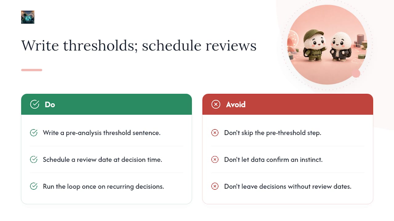
- Set thresholds before analysis. The single most effective mitigation. Write the threshold into the decision brief before anyone runs a query.
- Run a pre-mortem. Before committing to a decision, ask the team to imagine it has failed six months from now and list the reasons why. This surfaces assumptions that the data does not cover.
- Use blind cohorts. Where possible, have the analyst who builds the dataset be different from the analyst who interprets it.
- Require independent replication. For high-stakes decisions, have a second analyst reproduce the key finding from the raw data before it is used.
- Evaluate proxy metrics carefully. When primary data is scarce, proxy metrics need explicit validation before they are treated as decision-grade evidence.
Pro Tip: When you lack the data to make a decision confidently, run a small, cheap experiment to generate it. A two-week A/B test or a pilot with ten customers produces decision-grade evidence faster than debating assumptions in a meeting.
What does a good decision documentation template look like?
Decision documentation should capture five elements: the decision made, the owner, the supporting evidence, the assumptions, and the review triggers. Together, these create an auditable record that prevents the same debate from recurring and allows the team to learn from outcomes over time.
| Field | Description |
|---|---|
| Decision | One sentence stating the action taken and the timeframe. |
| Owner | Full name and role of the person accountable for the outcome. |
| Evidence | The metrics used, their values at decision time, and the sources. |
| Assumptions | What you are taking as true that the data does not directly confirm. |
| Review trigger | The specific threshold or date that will prompt a reassessment. |
Completed example
Decision: Increase paid search budget for the next two months. Owner: Head of Growth, Sarah Chen. Evidence: Return on ad spend above threshold; conversion rate stable over recent weeks; competitor spend increased moderately (sourced from auction insights report, pulled 14 March 2026). Assumptions: Audience size remains sufficient to absorb the increased spend without significant CPM inflation. Review trigger: If ROAS drops below 3.0 at the 30-day mark, budget reverts to baseline immediately.
Keep the brief to one page. For low-cost, reversible decisions, a three-line log entry is enough. For high-cost or irreversible decisions, the full five-field template earns its keep because the cost of being wrong is high enough to justify the extra ten minutes.
Which tech stack categories do you actually need?
You do not need an enterprise data platform to start. The right tooling depends on the volume, latency, and complexity of the decisions you are making. Here are the five categories that matter, in the order you typically need them:
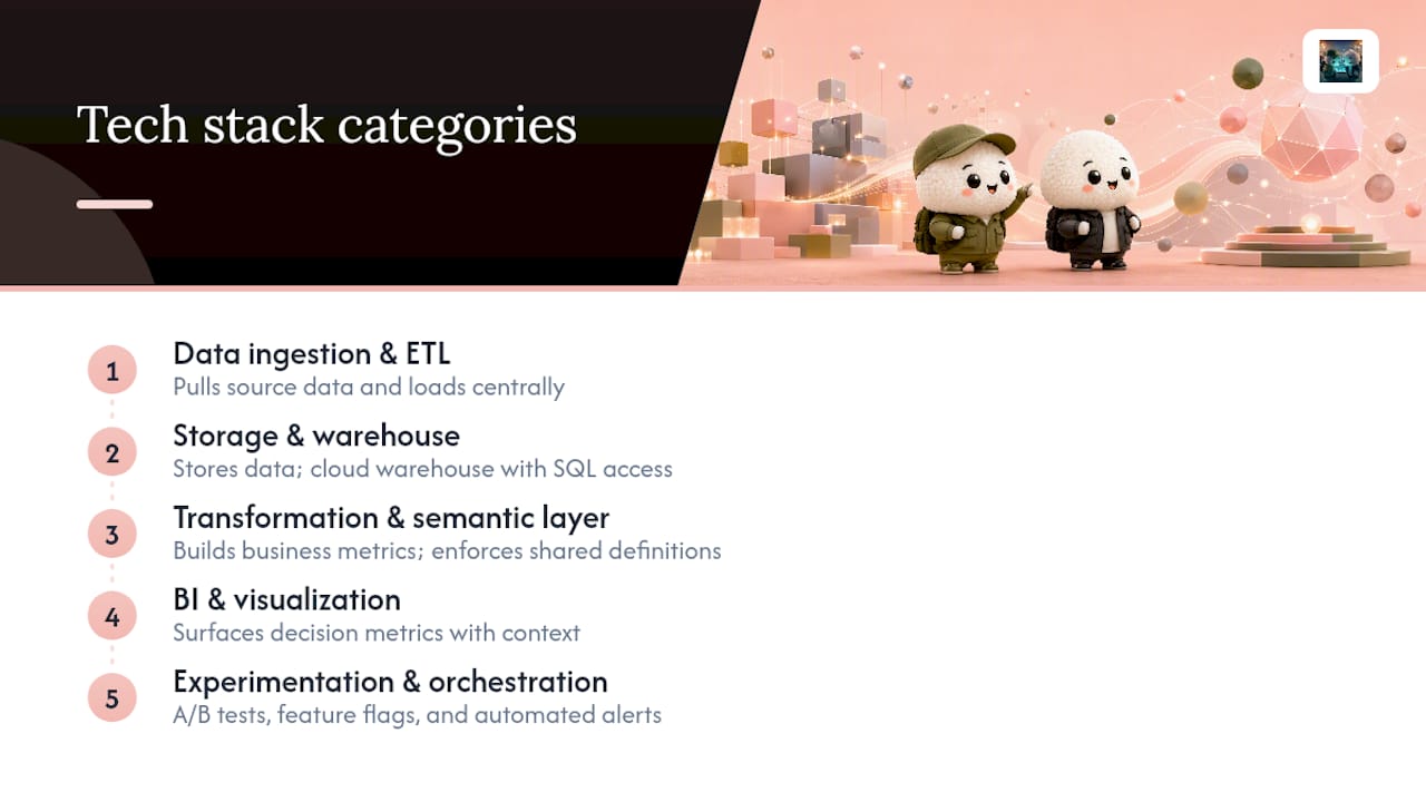
Data ingestion and ETL. Tools that pull data from source systems (CRMs, ad platforms, databases) and load it somewhere central. At small scale, a scheduled export to a spreadsheet works. At mid-market scale, purpose-built ETL tooling handles this reliably.
Storage and warehouse. Where your data lives once it is ingested. Cloud data warehouses handle structured data at scale and support SQL queries that most analysts already know.
Transformation and semantic layer. The layer that converts raw warehouse tables into business-friendly metrics with agreed definitions. This is where fragmented definitions get fixed. A semantic layer ensures that "revenue" means the same thing in every dashboard.
BI and visualisation. The layer your decision owners actually see. Good BI tooling lets non-technical users explore data without writing queries. The goal is not beautiful charts; it is a single number with context, visible to the person who owns the decision.
Experimentation and orchestration. A/B testing frameworks, feature-flag tools, and workflow automation that routes alerts to the right person when a threshold is crossed. AI-driven trend detection tools increasingly handle the orchestration layer by surfacing signals before a human would notice them.
Selection checklist
Before committing to any tool in any category, confirm:
- Does it handle your current data volume with headroom to grow?
- Does it support the access controls your governance model requires?
- Can non-technical decision owners use it without analyst support for routine queries?
- Does it produce an audit trail (who queried what, when)?
- Can it trigger an alert or action automatically when a threshold is crossed?
A spreadsheet plus SQL queries is genuinely enough for a team running fewer than ten recurring decisions per month. The case for platform investment grows when decisions multiply, when data sources fragment, or when the cost of a missed signal exceeds the cost of the tooling.
What does a realistic implementation timeline and cost look like?
| Phase | Duration | Key milestones | Effort (people-hours) |
|---|---|---|---|
| Pilot | Weeks 1–6 | One decision framed, threshold set, loop closed, review completed | 20–40 hours (small team) |
| Scale | Months 2–4 | 3–5 decisions in the loop, metric dictionary drafted, data owners assigned | 60–120 hours |
| Govern | Month 5+ | Governance layer live, self-service dashboards deployed, review cadence set | Ongoing: 5 hours/month |
Cost drivers vary significantly by organisation size:
- Small team (under 20 people). Tooling cost is near zero if you start with existing spreadsheet and query tools. The real cost is analyst time: roughly 20–40 hours for the pilot. The risk is that no one owns the process, so assign it explicitly.
- Mid-market (20–200 people). Tooling investment becomes worthwhile once you have more than five recurring decisions and multiple data sources. Expect 60–120 hours of setup effort and modest monthly tooling costs depending on the platforms chosen.
- Enterprise (200+ people). Integration effort dominates. Data from multiple systems needs a semantic layer to prevent fragmented definitions. Budget for a dedicated data owner role and a governance review cadence.
The practical advice that holds across all sizes: pick one high-value decision to start, close the full loop, and let the experience teach the team the behaviour. Buying tooling before the process exists is the most common and most expensive mistake.
How Ontherice gives you a faster signal for every decision
Executing the six-step playbook above requires one thing most teams lack: a reliable, early signal that arrives before the outcome is already visible. That is exactly what Ontherice's B2B signal feeds are built to provide.

Ontherice scans global public data across finance, technology, brands, and emerging markets in real time, then surfaces ranked signals with transparent prediction accuracy tracking. Where most teams are still debating whether a trend is real, Ontherice users already have a scored, ranked signal they can drop straight into step 3 of the playbook as decision-grade evidence. The rankings engine shows you not just what is rising but how confident the model is, so you can set your threshold against a signal score rather than a gut feeling.
For teams ready to move from dashboards to decisions, the platform's live AI query layer lets you interrogate signals in plain language and get a structured summary you can paste directly into your decision brief. Visit Ontherice to explore the signal feeds and see which markets are moving right now.
What the playbook taught me about where teams actually get stuck
Most articles on data-driven decision tips spend the bulk of their words on frameworks and almost none on the moment the framework breaks down. In practice, that moment is almost always the same: the threshold was never written down before the data was pulled.
Teams that skip the pre-threshold step do not make worse decisions because they lack data. They make worse decisions because the data becomes a prop for a conclusion that was already forming. The analyst runs the numbers, the decision-maker scans for the figure that supports their instinct, and the meeting ends with everyone feeling rigorous. The documentation, if it exists at all, records the outcome rather than the reasoning.
The fix is genuinely simple, which is why it is so easy to skip. Write one sentence before the analysis starts: "If X reaches Y, we do Z." That sentence is the difference between a data-driven decision and a data-decorated one. The six-step loop, the documentation template, the governance model — all of it is scaffolding around that one sentence.
The second place teams get stuck is the review stage. A decision with no review date is a decision that never closes. The team moves on, the outcome drifts, and six months later no one can remember what they decided or why. Scheduling the review at the moment of decision is not bureaucracy; it is the only way the loop teaches you anything.
If you are starting from scratch, pick the most expensive recurring decision your team makes and run it through the full loop once. Not because the decision will be perfect, but because the experience of closing the loop is what builds the habit.
Sources
- Data-driven decision making: a framework that goes beyond dashboards
- Data Driven Decision Making: A Practical Framework (2026)
- 6 key steps form a data-driven decision-making framework | TechTarget
- The Advantages of Data-Driven Decision-Making - HBS Online
- Data-Driven Decision Making: A Practical Framework | clariBI